Critical Analysis of a photograph (part1)
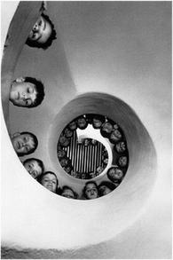
Henri Cartier Bresson
Reference: http://wevelostcontrol.com/2012/08/14/henri-cartier-bresson-documentary/
Form:
From looking at the photograph, I can see that the photographer used the dominant elements of line, texture, shape and space. The use of line in this photograph is thick and curved. The direction of the line is turning upwards from bigger circles to smaller circles. There is a center of interest in the photograph. The circle curve lines bring out the shape of bigger space to small and also the line of symmetry. The space does not isolate the dominant object. The subject does fill the space by following the curved line. I do not feel there is too much space because I think the space can brings out the subject more. There is only one major shape that is circles. It is interesting because the shape can bring out the space together with the subjects. The texture of the photo is smooth. The photographer bent down or lies down on the floor and took from the bottom with the camera facing directly upwards to show the elevation from the bottom of the stairs. I think the photograph do not have to add anymore other texture to make it better. The use of colour in the photograph is black and white. If the photograph had colour, it will detract from the subject because the contracts will decrease and it will not able to show the subject and space clearly. The photographer used the principle of ark of repetition, pattern and contrast.
Context:
This photograph was taken from Henri Cartier Bresson. He will stay in a place for no matter how long for waiting a perfect moment to capture a photograph. The work related to other photography of that time of they are all black and white and all about street life. It related to how was children live that time, it also related to child labor.
Content:
This photograph showed there were a lot to children lining all around of a circle stairs. It is neither a portrait nor landscape. The work represent the children life in that time and also child labor. I think the work represent the child labor or wars in that time and the title doesn’t change the way we see the work. There are not any parts been exaggerated or destroyed. The theme of the work is to show the children life of that time. The work sent the message of letting others know how the situation of the children that time.
Process:
The photographer used a single lens reflection camera, the evidence of this is there were not any digital cameras by the time he took this photograph. The photographer had to lie down on the floor to capture the elevation from the bottom to the top of the stairs. The evidence for this is we can see the direct elevation from the bottom to the top of the stairs and the children are looking downwards to the photographer.
Mood:
The work makes me feel that the children in that moment were not having a good time. I feel this because there are no smiles on their faces and seems they had been punished. The composition and the camera angle affect my mood for the photograph and the work does create an atmosphere.
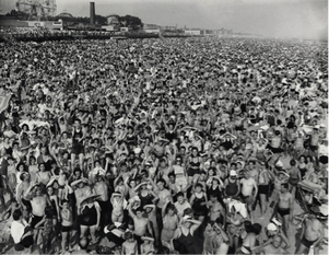
Weegee - Crowed in Coney Island
Reference: http://www.amber-online.com/exhibitions/weegee-collection/exhibits/crowd-at-coney-island-1940
Form:
From looking at this photograph, I can see the dominant element of texture and space. The line in the photograph is thin, curved and messy. There is no a specific direction. There is a lot of space area in the photograph although there are full of people, it is too crowded and it created a flat space. There is not any center of interest. The space does not isolate the dominant object and the subject did fill in the space and I think there is too much space. The shape in the photograph is negative shape since there is not really a shape because it is full of people. The texture of this photograph is very rough. The photographer took it from a higher place to show the texture more and show how crowed was the place. The colour of this photograph is black and white. If the photo had colour, I think it will add more contrast for the photograph since it is too crowed and I cannot really see the main subject. The principle elements of this photograph that have been used are repetition and pattern.
Context:
Weegee took this photograph in 1940 at the Coney Island. He focuses his work of taking senses of urban life, crime, injury and death. The work related to other photography of the time because they all have a realistic sense of street life. The work does related to the social history of that time.
Content:
This photograph shows there were a lot of people at the Coney Island. They were all wearing swimming suit, it think there was a swimming event. The work represents the crowded atmosphere of Coney Island and it is not a landscape photograph. The title of this photograph does not change the way I see the work. The theme of the work is to show the crowded atmosphere of Coney Island. It showed what the photographer feeling of the Coney Island.
Process:
The photographer used graphic speed camera. The photographer stood in a higher place to take this photo since we can see that he angle is looking downwards.
Mood:
This work make me feel that the place was really crowed and everyone in a happy mood and atmosphere because there are so many people and they look happy. The camera angle does affect the atmosphere and the work does create a lively atmosphere.
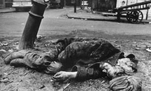
Don Mc Cullin
Reference: http://www.guardian.co.uk/artanddesign/2012/nov/15/don-mccullin
Form:
From looking at this photograph, I can see the dominant element of shape, texture and space. The line in the photograph is thin and curved. They are mostly horizontal in direction. There is a bit space at the back. There is a center of interest, the homeless woman. The space does not isolate the dominant object. Also, the subject does fill the space therefore I do not feel there is too much space. The shape in the photograph is negative and it is interesting. The texture of the photograph is rough. I can see it from the clothing of the homeless woman and the floor that she lied on. The colour in the photograph is black and white. If there had colour in the photograph, I will add the photo more contrast. The principle of elements that have been used in this photograph is contrast.
Context:
This photograph was taken by Don Mc Cullin in Spitalfields market, London, 1969. He took a homeless man lying by the embers of a fire.
Content:
This photograph shows there was a homeless man lying on a floor and it was tookken in a landscape. The work represents the poverty in that time. This title of theis work did not change the way I see this photograph and there are no part have been exaggerated or destroyed. The theme of this work is to show the homeless problem and the message behind is to tell others the homelessness and poverty in that time.
Process:
Doc Mc Cullin used old Nikon camera to make the piece. The ecidence for this was the Nikon camera have just invented that time.
Mood:
This work makes me feel sad. Because there are homless people who doesn't have a shelter to sleep. The composition and the lighting do affect my mood for the photo and this work does create an atmosphere.
